Veerle Review
Link to SiteCode Review
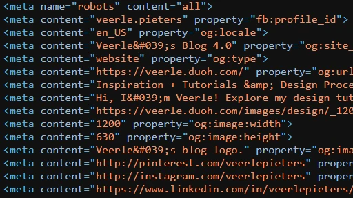
The first thing that I notice upon opening up the page source is that there is zero indentation. Whether this is a design choice or something more akin to the use of generated code, either way, I do not like it at all. The whole purpose of indentation is to make it easier for the code to be read, and I'm having a hard time reading through it myself.

UI Review
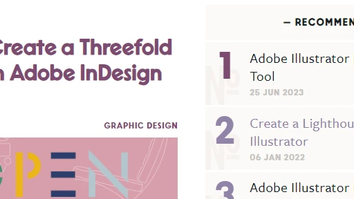
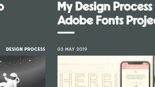
I understand the design choice, but as I tend to stand on more of the minimalistic side, I do not agree with it. There's honestly too much going on for me. Colors are all over the place, designs seem to be drawing attention away from the content in certain places. I'd argue there's nothing wrong with these designs on their own, but there's just too much of it.

UX Review
The one saving grace of this site for me is the UX. I think the way things move as they are hovered over isn't too flashy, and the movement of colors and effects is fairly simple, and not very extravagant. Not a lot to focus on, but as I said, I'm preferential to simplistic design, and when the UX is relatively short and sweet in this case, it's the best feature for me.

Summary
In Summary, we talked about the code, it's lack of indentation and spacing (although this could be the fault of computer-generated code and not necessarily a design choice). We talked about the UI, and how the vast number of color combinations, while a nice design choice for some, is too much for me to handle. And lastly, we talked about the UX of the site, and how I think it's nice and not too flashy, unlike the site's UI.