Awwwards Review
Link to SiteCode Review
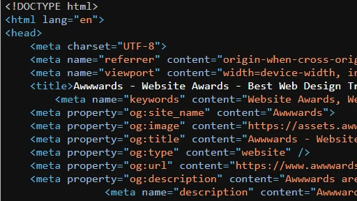
Probably the largest site I've had to review in terms of code, but it's actually indented very well. There's a lot of repeating elements, but I suppose it's to be expected on a site like this, that's constantly changing. It's likely my lack of experience, but I would be under the assumption that the site is almost entirely built without the use of computer generated code or some sort of tool similar to that. Honestly, the code looks the best out of all the sites I've reviewed.

UI Review
As I've said in previous reviews, I'm much more satisfied with a more minimalistic UI and design. And while there is a lot going on in the realm of UX, the UI of the page is incredibly straightforward. The colors are a simple combination of black, white, and gray, and the site is appealing without being overwhelming. There's some very interesting designs going on with the top banner that is constantly moving, and is very impressive. All in all, this is my favorite design of the 3 sites I've reviewed. Bonus points for the site working just as well in dark mode as it does in light mode.

UX Review
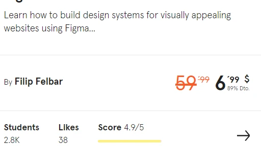
When I did the Veerle review, I didn't like parts of it because of how in your face it was. Then I realized that much of it was meant to be a showcase for differing designs. While I still think the UI of it was overwhelming, I will argue that the UX is still the best feature of it, and that in many ways, Awwwards has a very similar concept in mind for it's UX. instead of being a site that showcases different designs for websites, Awwwards is a site that showcases other websites, similarly to what we're doing here. In that aspect, there is a lot going on all at once, but it is still largely easy to navigate, and offers ideas to other developers for good websites.

Summary
In summary, we talked about Awwwards' code, how it's largely very well indented and seems to be all human-made. We talked about the UI, it's general simplicity in terms of color and how much is happening per section, and we talked about the UX and how it functions as a showcase for websites and it's ease of navigation.