Envylabs Review
Link to SiteCode Review
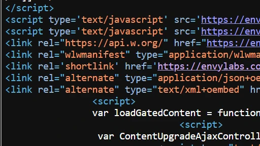
The code on the site is interesting, and quite varied. There's a heavy use of script tags via Javascript, and also includes the use of some plugins. Lines 285-296 also include the use of a tag I've never seen before, the Polygon tag, which appears to create shapes on screen. That could explain how the cubes in the background were created. The only problem I have is that not all the code is properly structured, meaning that there's weird indents or no indents in certain places.

UI Review
The UI looks pretty great, minus one nitpick that I'll get to later. The background is exciting, isn't too flashy, and everything flows as you move down the page. The way cards pop out as you hover over them is aesthetically pleasing, and while there is some empty space, the majority of it has a great amount of purpose.
Now this is a very specific nitpick for myself, which is that I like to use dark mode on my browsers. When I first opened this site (in dark mode), it looked absolutely awful. The background polygons cover up the words on the front, making it a very hard webpage to read. Of course, trying to appease both dark and light mode users is probably a highly difficult task based on the design you want to have, so this is mostly just a problem I have. I wouldn't necessarily worry about it.

UX Review
In terms of the user experience, the site flows very well. The UX is helped along by the quality of the UI, likely to show off the quality of sites and applications that they've made. The customer need only go down to see all the things they've created for other companies, or go up to the menu to contact them, and that is all that's required of them. Largely, the site seems like an easy experience.

Summary
In Summary, we talked about the code of the site, how it makes a heavy use of javascript and how it's not necessarily the most pleasing code for the developer, but still well made. We talked about the UI of the site, how the background and foreground work well with each other and are largely visually pleasing, unless you use dark mode on your web browser of choice. Lastly, we talked about the UX, and how the site is very easy for a customer to use, just by going to the menu, or seeing reviews from people that have used Envylabs' services.