Assignment 01: Extract UI Items
Return to Main Page
Jekyllrb site

1. Popout Panel
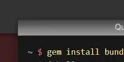
I like this block holding some code near the center of the page, because it literally looks like it's popping out of the page itself.
Using a combination of Padding, Line height, and shadows, the box in the picture was able to imitate the effect of appearing somewhat higher up than the rest of the page.

2. Arrow
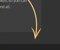
The arrow near the bottom of the page stands out in comparison to the rest of the area at the bottom.
The creator of the site pulled this arrow from the web (or created it themselves) as a transparent image and positioned it to the bottom right of the page.

3. "Fall off the edge" borders
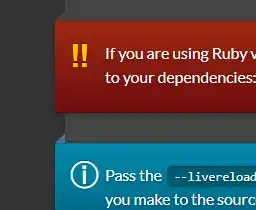
While the front part of this border in the Docs page of the site looks similar to the popout in the first UI item, it has an edge that seems to fall off the page.
using this "Before" code in the element inspector, and creating an area that is behind and extending the line, it creates the optical illusion that adds more width to the line.

4. Pushed in Panel
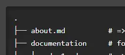
Opposite to the first item on the list, this block of code under Docs > Pages appears to be pushed into the page rather than popping out of it.
This one took a while, but it appears to be a combination of things, one being padding and a setting called "Overflow", as well as increasing the line height around the area and making the background color stand out from the rest of the page.