Google Chrome
Firefox
IE
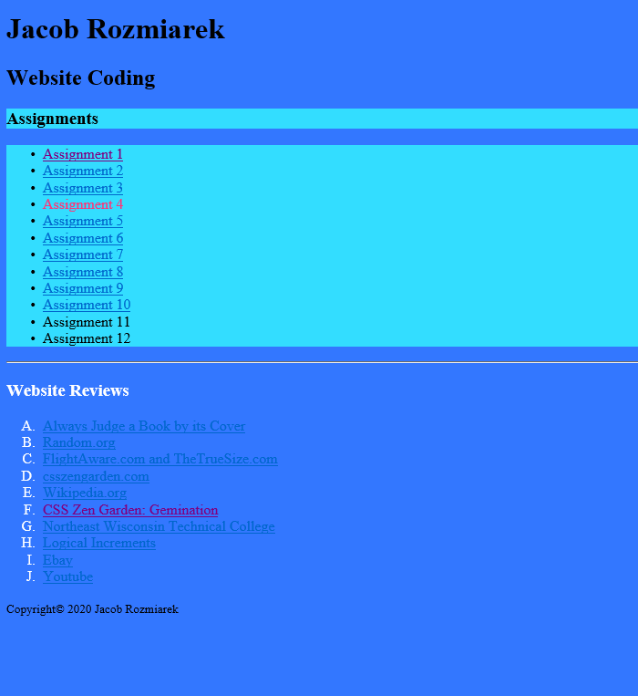
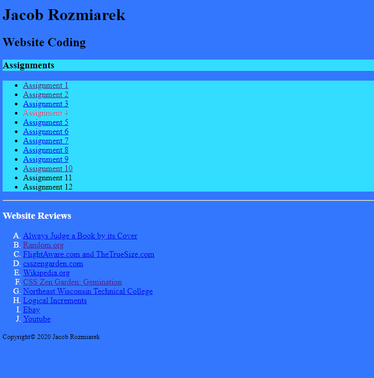
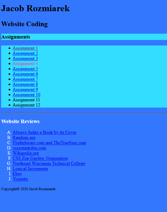
This list will showcase the three images from each browser on each site's homepage.


There are two changes amongst the homepage that I can clearly see. For one, the horizontal line color is a dark grey for firefox, while it is white in Chrome and IE. At the same time, the Font color of the hyperlinks in IE is a lighter shade of blue than the hyperlinks in chrome and firefox. To Fix them:



Just like with the last page, the font color of the anchor tags in IE is a lighter shade of blue in comparison to the others. Once again, to fix, add this to your css: a { font-size: 100%; color: #0000EE; font: inherit; }


Once again, the only difference I can see is the color of the hyperlinks. It would probably be pertinent to add both visited and unvisited colors to the CSS. It would read like: :link { color: #0000EE; } :visited { color: #551A8B; } You may change these as long as you have a baseline set here.
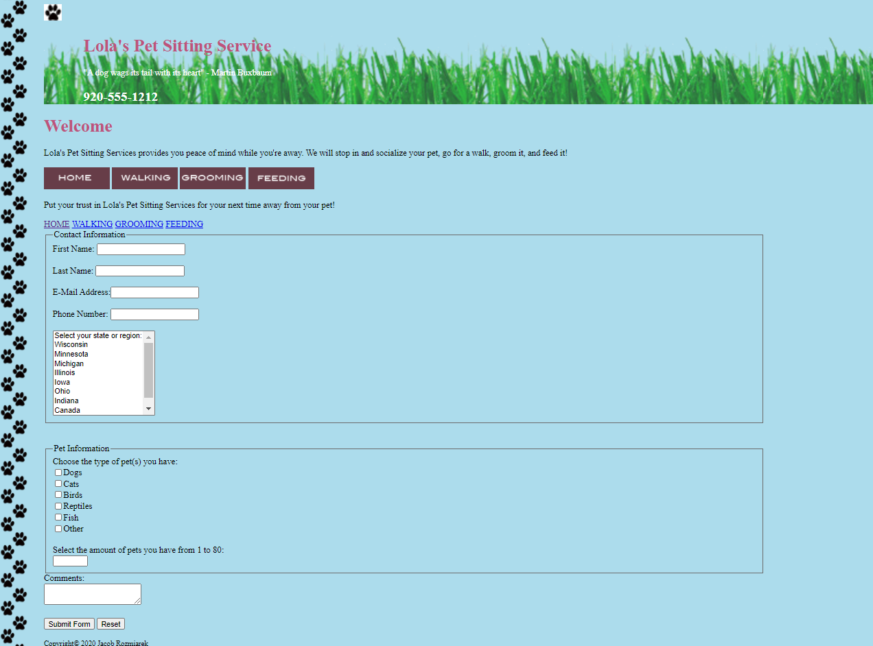
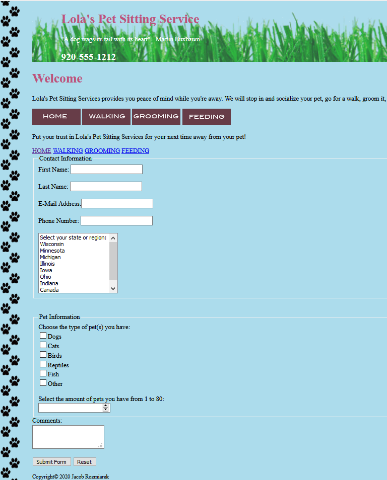
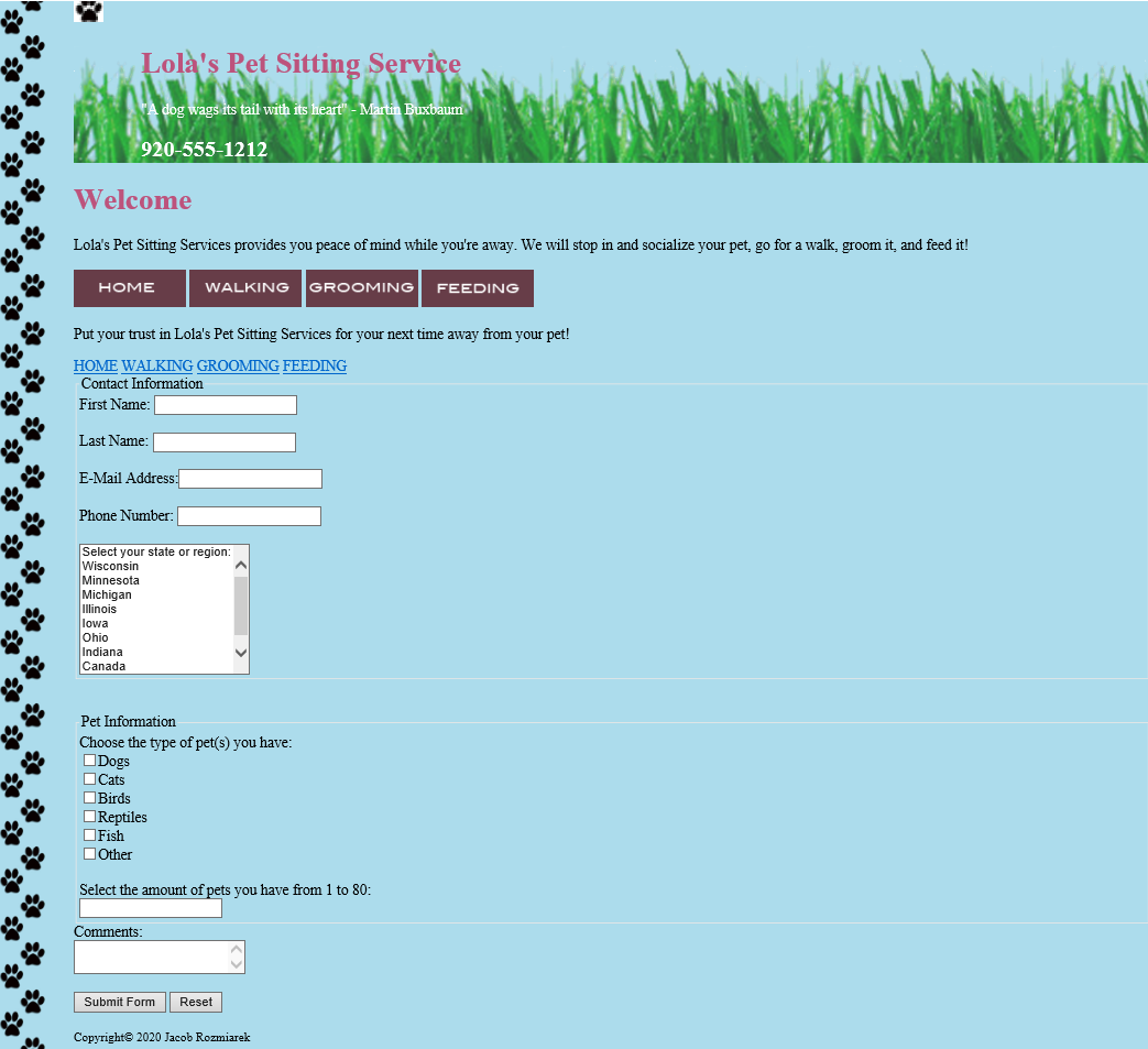
besides the anchor tag color, there are a few small details. The check boxes in Firefox and IE have straight edges, while chrome's checkboxes are more rounded. There are other small details within the form like the select element having different types of arrows, the comment box having either arrows or an option to expand the box freely, etc.
Copyright© 2020 Jacob Rozmiarek
Return to main page